This article discusses the extremely shaky data based on which the governments have acted "evidence-based". Examples discussed include the vague reproduction factor, insufficient specifications in the numbers, the impossibility of "crash the curve" in the Netherlands and the second wave.
Lees volledig artikel: The new big bad wolf, the second wave
The new big bad wolf, the second wave
Working with data all my working age, I must confess that I pull the hair out of my head every day when I notice how badly people deal with data. (That’s handy because I haven’t been able to go to the hairdresser for 8 weeks).
There have been interventions by the authorities, which we couldn’t have imagined until three months ago. However, they have intervened on the basis of very shaky data. And this in cooperation with professionals, who very often use the word “evidence-based”. And the sad thing is, most politicians as well as the media seem to hang on the lips of these experts.
A few examples:
The vague reproduction factor
The so crucial reproduction factor (R0) is not a G’d given formula that you can apply just like that. Choices have to be made when defining R0. The choices you make influence the outcome.
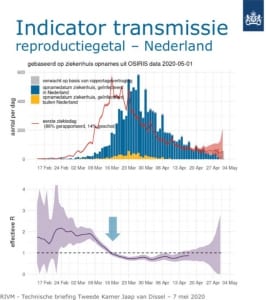
If you know exactly how many infected people there are per day in the Netherlands, you can easily calculate that figure. But we do not have these figures (which are impossible to obtain). Th amount of testing only provides a small part of them. In the absence of that data, you have to approach it via other methods. But because of that, the R0 is only an indication of what is really happening with the spread of the virus in the population:
Indication
- The Corona mortality rates used by the RIVM are based on the mortality of people who had been diagnosed of having Corona. Based on the population registrar, Statistics Netherlands (CBS) determents how many more Dutch people die each week, than the average for that week in recent years. Anything more is called excess mortality and is then assigned to this virus. The CBS count is 2 weeks behind on average. If we then know that on average it takes 3 weeks between becoming infected and dying, the total delay is 5 weeks.
- Assuming the number of people actually found to be infected in the Netherlands (currently more than 45,000), the number found depends entirely on how many people have been tested. If we are going to double the number of tests in the near future, you will find more infected persons.
- If you base yourself on daily hospital admissions, which the RIVM apparently does, then these is another problem: It could well be that, because hospitals are less crowded now, they are less strict when accepting patients. That would mean an increase in the number of hospitalizations without the number of infections in the country increasing.
Margins of uncertainty
So the data is just an approximation of reality with considerable margins of uncertainty.
This was the last presentation of the R0 figure by the RIVM at the session with the Lower House on May 7th.

So on May 7th the R0 was presented based on the hospital admissions until May 1st. Hospital admissions will take place 10 to 12 days after the infection. So on average there is already a delay of 3 weeks.
To add insult to injury: The RIVM refuses to disclose which values they use in the R0 formula. Plus they don’t want to disclose what the current values are, as this tweet from a journalist shows:

So we can’t check how the figure is calculated, and we don’t get to hear the actual values.
A number of German universities show on their website the development of R0 in a number of countries, including the Netherlands. And then you see exactly the problem I outlined above. Those figures are based on the number of people infected. So if we start testing significantly more in the coming month, we will find more infected people and R0 will go up in this overview.
We regularly hear that “the R0 goes back to 1”, or even “that it’s passing it”. But realize that that R0 can be lower or higher at that moment. (The continuing decline of all key figures since the beginning of April suggests that over that period we must certainly have been well below 1).
Too few specifications in the numbers
But even if we had the perfect insight into the number of infected persons or hospital admissions or deaths, that wouldn’t mean anything to the policy if we didn’t specify it better.
Let’s assume that, thanks to the lock down in society, no one is infected anymore. But that there were still major outbreaks in care institutions. Then the key figures would indicate large numbers of victims, while there is nothing going on anymore outside these health care institutions.
Policy would then be determined by the overall figures, because we have no other choice. And that would lead to decisions with major consequences for the economy and society.
Imagine that the figures do indeed rise. Is it because the schools have opened, the contact professions have become active again, we go outside more, the swimming pools are open or because there are new developments in the meat industry?
Spoiler alert:
We don’t know because we do not have the data!
And so we run the risk, that if the increase is only due to the swimming pools (which I don’t think), the consequence will be that we will reverse the whole package of measures.
And it could easily have been different. If we had just taken a questionnaire from every infected person, including questions that can be used to determine what caused the infection. Then we would be able to follow the spread of the virus over time. And we could see the pattern changing per day with every new case. (Which is quite simple to do. I have been using NoTies software for almost 20 years. Usage costs are very low and it can be used on any device.
But it just seems that people don’t realize how important it is to collect data in order to have the best possible policy.
Crash the Curve, impossible in the Netherlands
There are several experts who say on TV that it is better to stay in lock down for a while longer to minimize the number of infected people. Because if we only open up after that, then we can keep things well under control by means of a targeted policy on the people who are still infected.
May I help those who suggest that to wake up? The way in which we organize contact research and set up and maintain quarantines in the Netherlands, would lead to laughter in South Korea. Just follow the discussions in the media about organizing the contact investigation. National newscast Newsuur has devoted several reports to it. This was the most recent, more than 2 months after the start of the pandemic.
And if we are not perfectly able to investigate new cases and to warn and control all their contacts, the numbers will rise again.
Meanwhile, Crash the Curve is also Crash the Economy (if it hasn’t already happened anyway).
We are neither trained, nor prepared, to keep the number of new cases close to zero.
The latest big bad wolf: the second wave
It’s really laughable if it wasn’t so sad. Recognize the drastic measures based on unreliable figures and the colossal consequences they have.
I am convinced that when our governments’ measures are evaluated in a couple of years, conclusions will be that they promoted total panic worldwide, based on a primary fear of death. That fear is understandable for an average citizen, but not for policymakers and their advisors.
Take the threats of “the second wave”. Using that term gives the feeling that if the number of cases rises again, we will end up in the “Bergamo scenario” again. The ICU’s can’t handle it anymore. The dead pile up in the corridors.
A we have to prevent that as much as possible, let’s maintain the lock down for a few weeks (preferably months).
First of all, I have already shown that the R0 is not a hard figure. And that rises can also be related to special circumstances in a certain place, or in a certain sector.
In addition, the number of ICU admissions (if that is the indicator) is now around 10 per day. At the end of March this was well over 100 per day.
High level
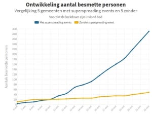
So if in autumn the numbers were to rise a bit, it will not see that high Bergamo level by a long shot. The simple fact that we have banned (super spread) events in the Netherlands, implies that the figures can only be as high as I show in a graph below.
The yellow line concerns the development in 5 municipalities BEFORE THE LOCK DOWN. In those municipalities no superspreading events were held (as in the municipalities with a blue line). Two groups of municipalities with the same number of inhabitants (150,000).
So in a period of 12 days (between March 10 and March 22), while doing everything that was forbidden by Prime Minister Rutte after March 15, the increase in the number of sick people was very clear (a doubling).

I repeat: that was when we were living our normal lifes. No social distancing, no restaurants and cafes that were closed and with people still working at the location of their company.
Learned?
There could indeed be a somewhat larger increase in new cases in the autumn, but only if we have not learned anything this summer and if governments still pursue a policy that is not based on data. And don’t try to gather data through all kinds of targeted tests, as explained here.
So realize, that every time we hear an expert in the media threatening with “the second wave” that it is mainly fear mongering. And not based on the evaluation of data. A continuation of the pattern that I’ve been observing for 2 months now, in which people say all kinds of things, without having a numerical basis/proof for it. With the additional fact, that it seems that in those two months hardly any more attempts have been made to collect the data.
The new big bad wolf, the second wave.


